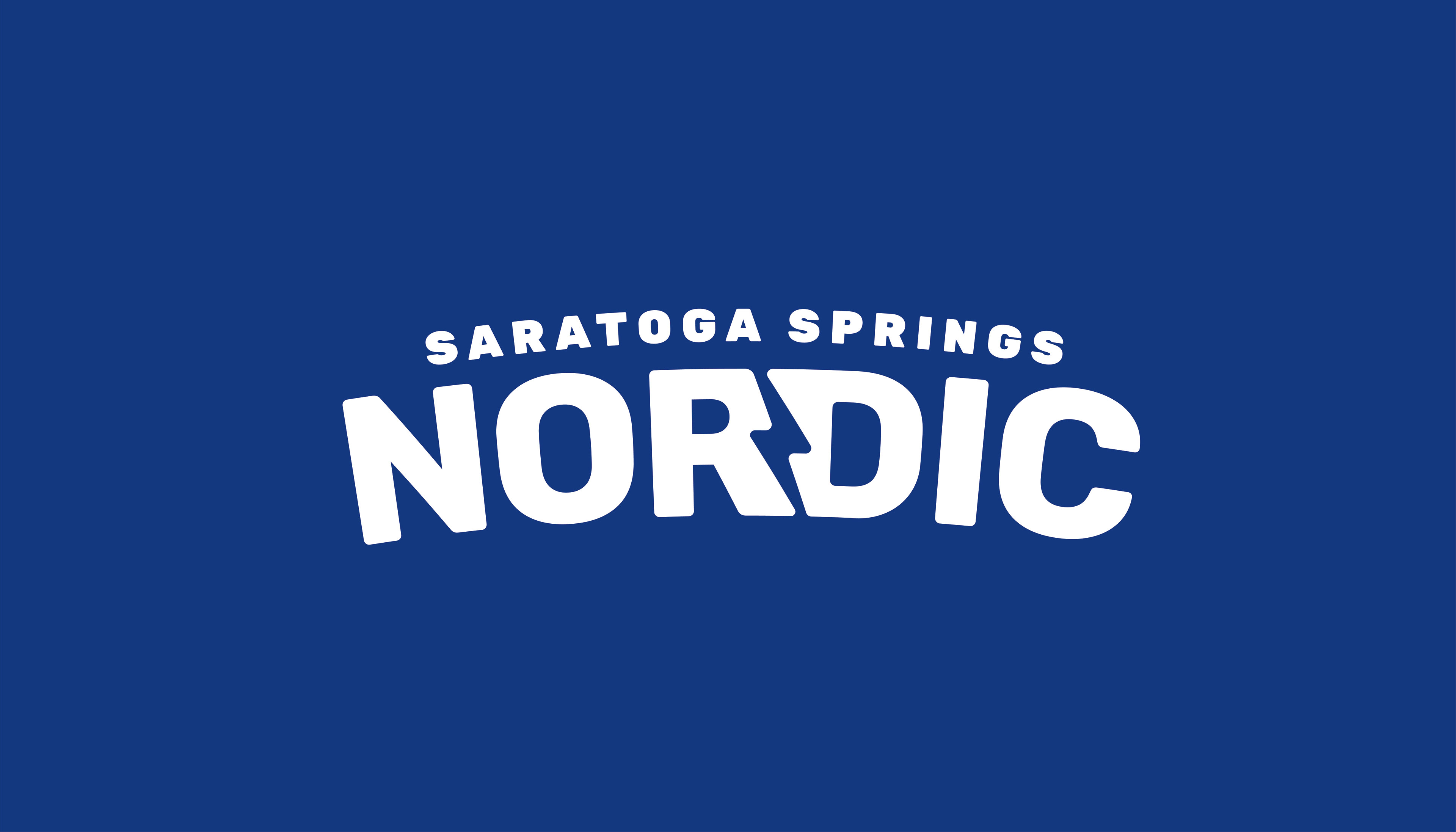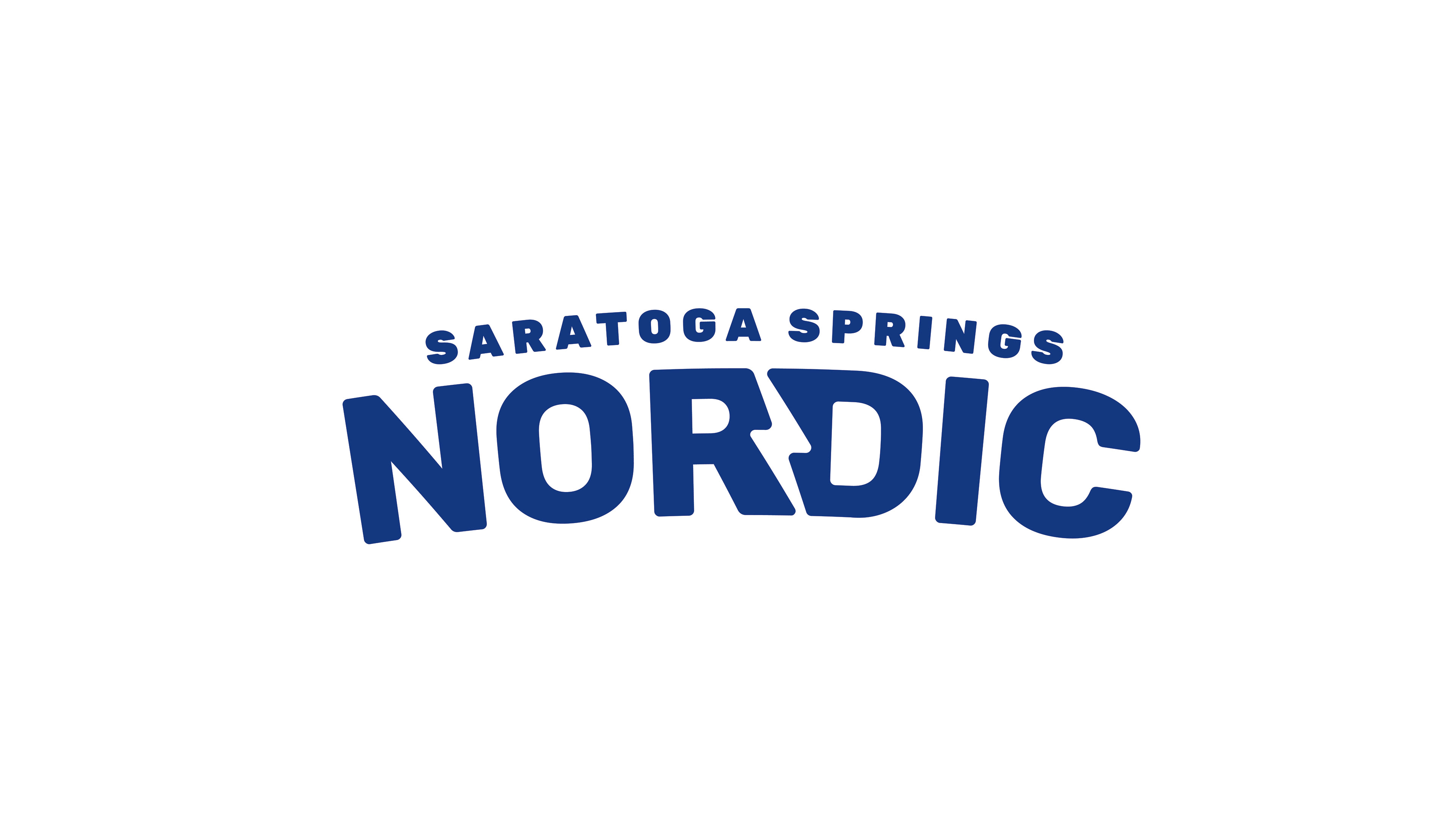
Client: Saratoga Springs Nordic Ski Club
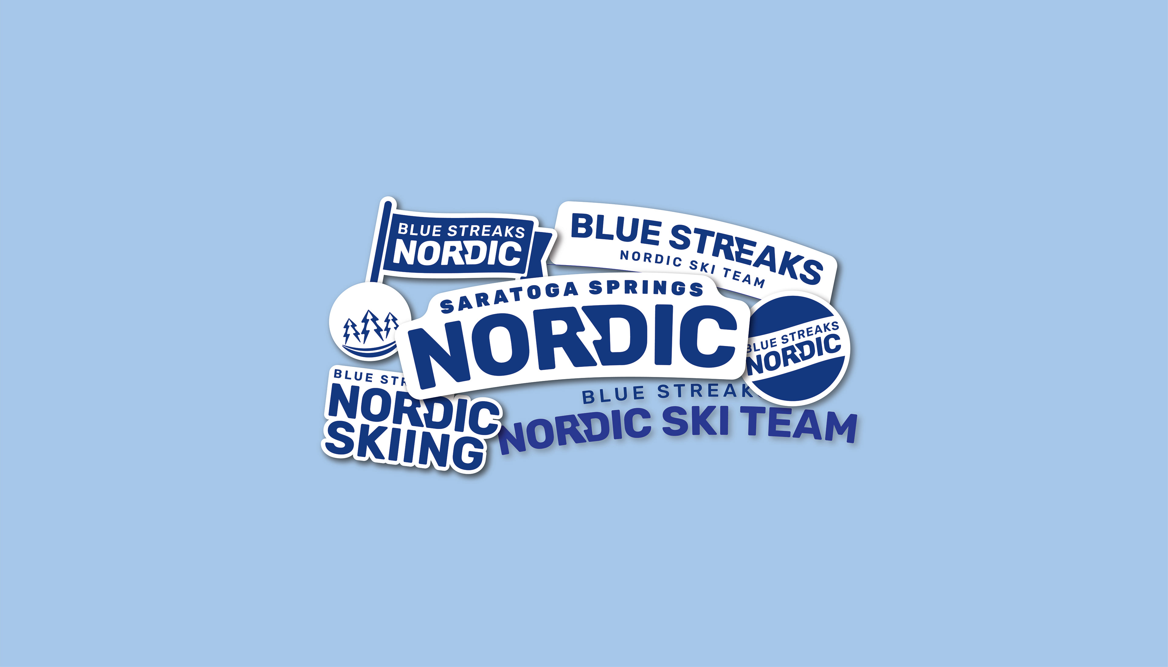
Challenge: Designing a minimalist and readable logo that could be used in a variety of applications from jerseys and outerwear to social media and print materials.
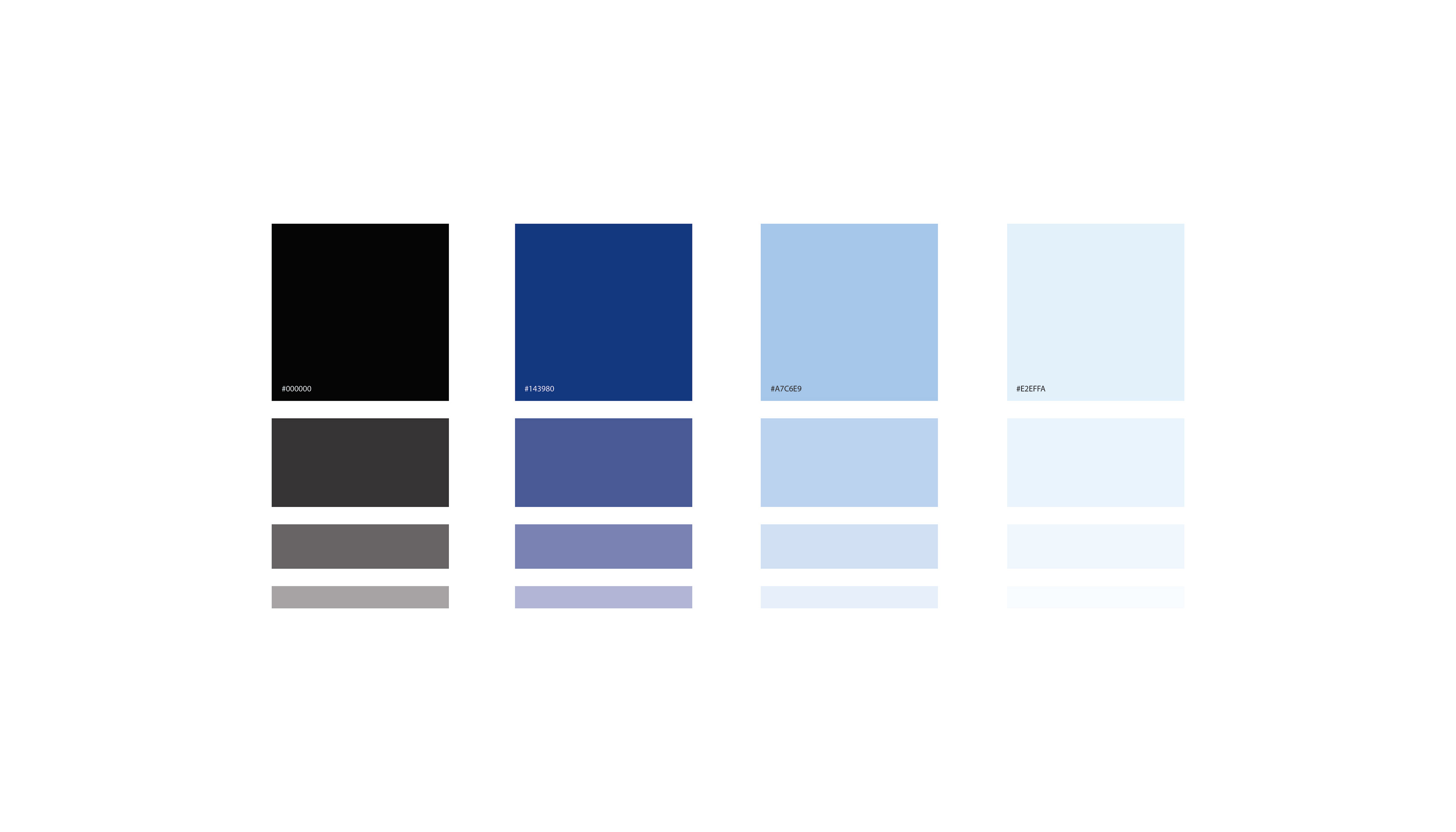
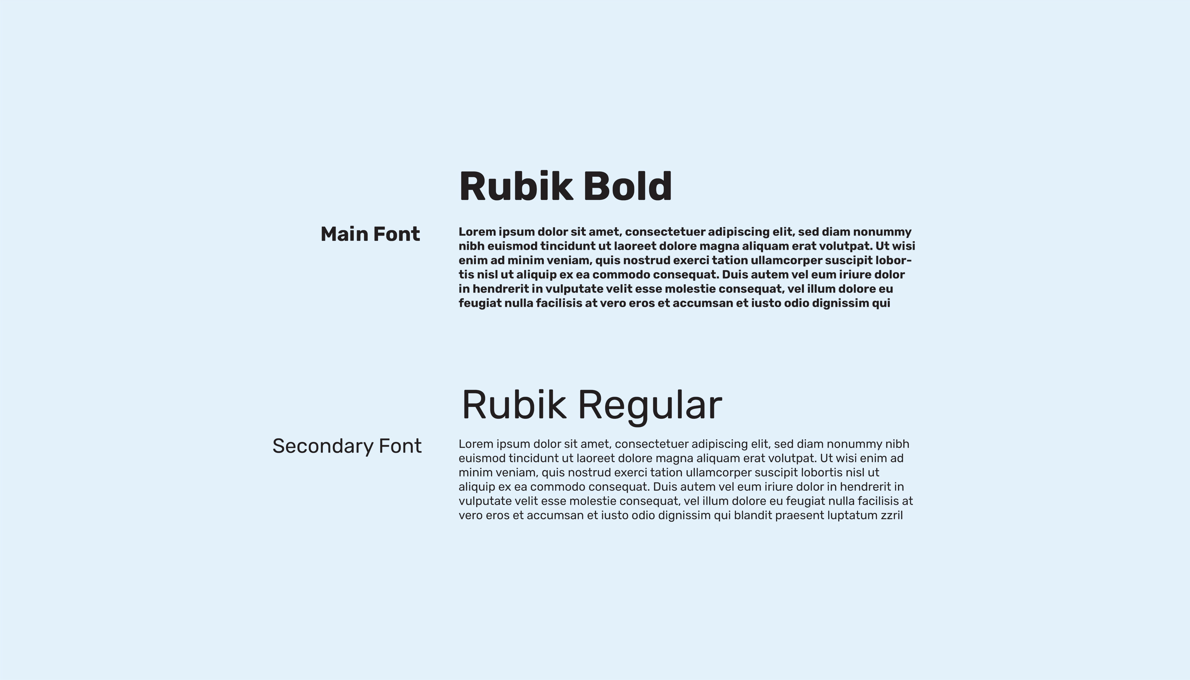
Role: As the sole designer, I was responsible creating the entire brand identity including logo, color palette, and typography associated with the club.
Results: The final logo and accompanying branding elements represent the Saratoga Springs Blue Steaks in a sophisticated and clean way that incorporates their symbol, the lightning bolt, in a subtle way.